

The bar is set pretty high for travel photography, but taking a quality photo isn’t too hard!
These days, the quality of smartphone cameras enables anyone to take a really high-quality photo – and if you experiment with the following, you’ll find yourself taking photos that make your followers feel as if they were there (or at least make them really wish they were!)
Think about framing & composition:
Deciding how to compose and frame your image can make a picture stand out, or drown in the surrounding content.
The “rule-of-thirds” is a commonly referred to composition technique, where you divide your photo into 9 boxes of equal size and try and align elements of your photo along the lines, or positioning the subject of your photo where the lines intersect. This helps to make a photo more interesting than just having the subject located smack-bang in the center of the shot. It works particularly well for photos of landscapes – as aligning the horizon or shoreline in the center of the shot can make the photo feel as if it’s been split in two, but aligning it roughly along one of the horizontal lines can make the photo more engaging.
Even if you don’t strictly stick to the rule of thirds, consider whether you want to take the picture close up or from a distance. What effect is created when the photo is taken straight on or from an interesting angle? Try taking the same picture from different perspectives and with the subject aligned in different parts of the frame and think about which one achieves the best results.
Framing is another composition technique where you use elements of your photo to create a “framed” effect within the image. Perhaps you’re taking a photo through a doorway, or you’re taking an image through tree branches. This helps bring the viewer into the picture and really feel as if they’re at that vantage point, looking through to the subject.
Let’s take a look at some examples:
1. Lough Eske Castle: Symmetry and framing
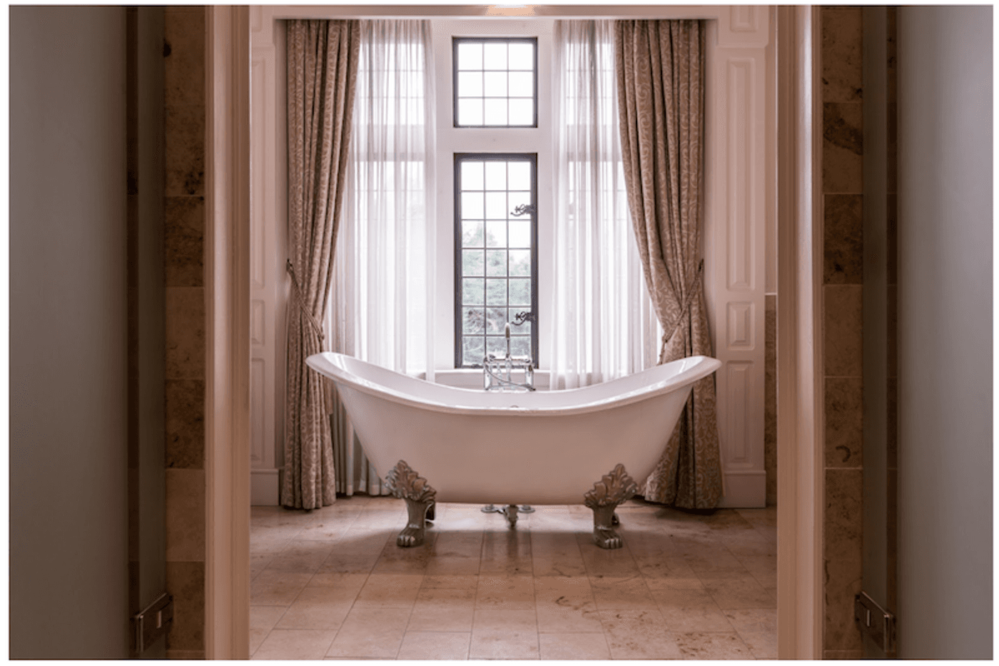
It’s not just the gorgeous, freestanding, roll-top tub that makes this photo great. The pleasing symmetrical framing from the doors adds a sense of luxury. It helps draw the viewer’s eye into the photo onto the subject (more on that later) and the fact that the bathtub is the only object in the photo conjures feelings of blissful relaxation that can be found at Donegal’s only 5* hotel, Lough Eske Castle.
You may have also noticed that this photo makes use of the rule of thirds, with the drapes around the window following the vertical alignment, and the tub falling on the lower horizontal line.
2. Hotel Santa Caterina: Framing and atmosphere
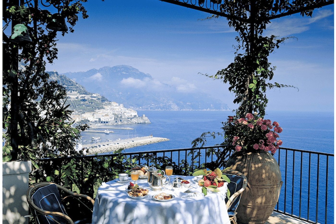
If this photo doesn’t encompass #ViewsToDieFor, what does? The artistic framing of this photo (the foliage and the balcony creates a frame through which you can peer out to the view along the coast) captures a breath-taking scene and tells a story to the viewer that invites them along on a journey.
It’s not just a coastal picture, and it’s not just a photo to communicate what you get for breakfast at the hotel. Each of the elements – the view, the breakfast table, the foliage – adds a sense of fullness to the frame and combine to communicate the luxury of the family-owned Hotel Santa Caterina overlooking the Amalfi Coast.
3. AndBeyond: Detail and focus
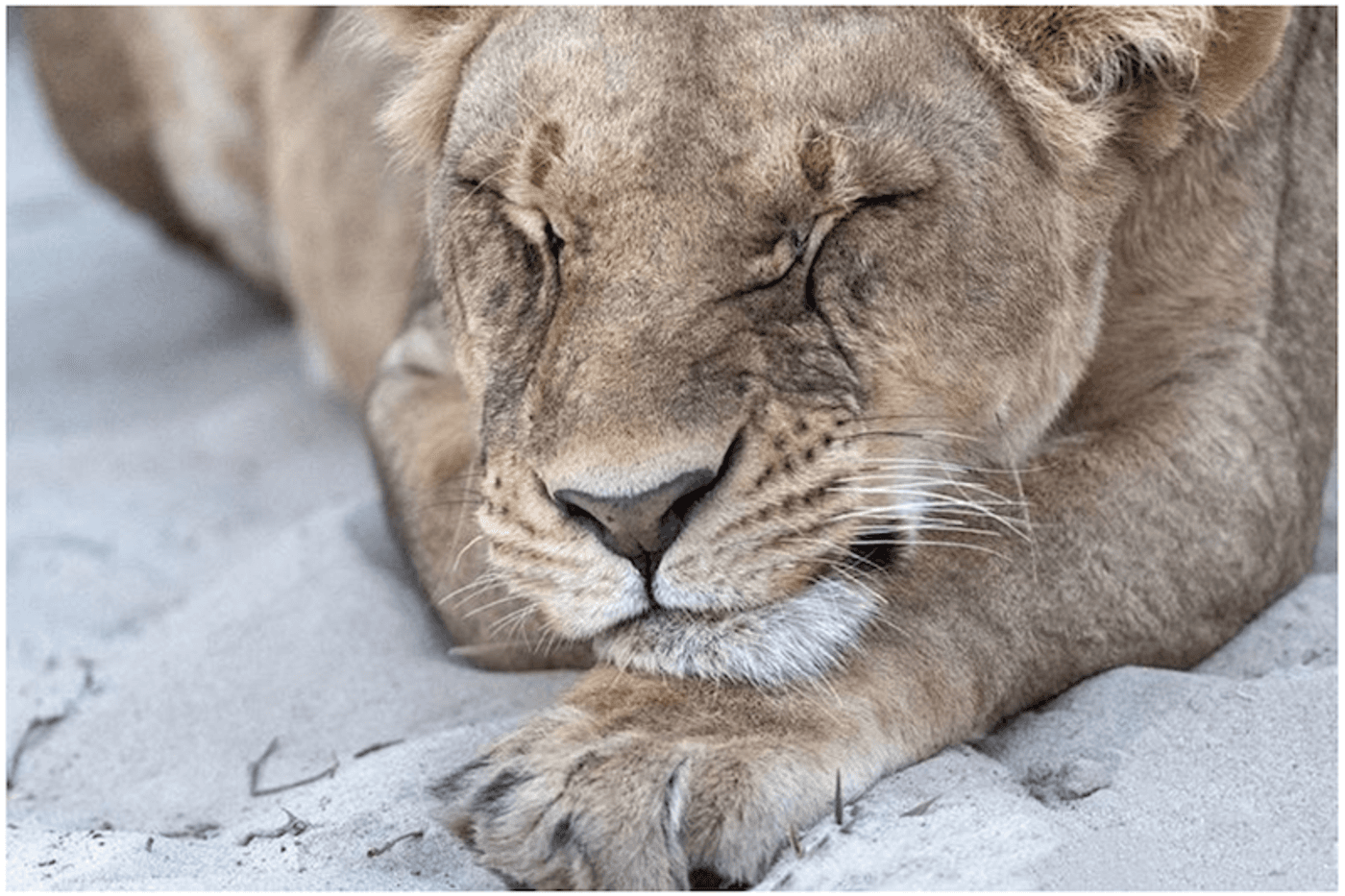
This is a great example of a close-cropped image from AndBeyond, a conservation and travel brand that specialises in experiential wildlife travel across Africa, Asia and South America.
This image brings the viewer right into the action (or inaction, in the case of this sleepy lion). If anything else had been included in the frame, the impact would be lessened and the overall effect lost.
Make sure you’re consistent with colours & filters:
The dominant colour or colours in your photos can communicate a lot about your brand. Muted, earthy tones say something quite different from bright primary colours. Think about when you see someone wearing certain colours—what first impressions are made by different hues?
Hand-in-hand with this is how you edit your photos.
Our smartphones come equipped with filters for every occasion, but that doesn’t mean we should use them. Filters can decrease the quality of your photos, which means they won’t look good any larger than a phone screen.
Sometimes it’s best to let the photo speak for itself with basic tweaking.
Photos that are used in print, and even online editorial, are generally better unfiltered with only basic adjustments. Unless you are proficient in editing software like Photoshop, it’s best to stay away from heavy filters that decrease photo quality.
If you do want to use filters on social posts, make sure you keep an unedited version of the original, high-resolution photo so you can use it for more versatile purposes!
We also suggest making sure you keep editing and filter use consistent across your images to help create a recognisable brand style.
1. Kivotos Mykonos: Grecian bliss
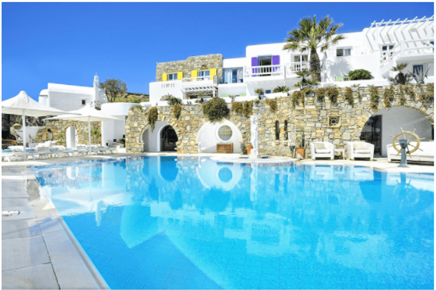
This image from Kivotos Mykonos, a luxury resort in Greece, is another great example of using vibrant colours. The turquoise pool, alongside the white buildings, is classically Greek and evokes feelings of luxurious days lounging poolside. The majority of Kivotos’ images use turquoise, blue, and white, which creates a consistent and true-to-brand representation.
2. Lanserhof: Crisp minimalism
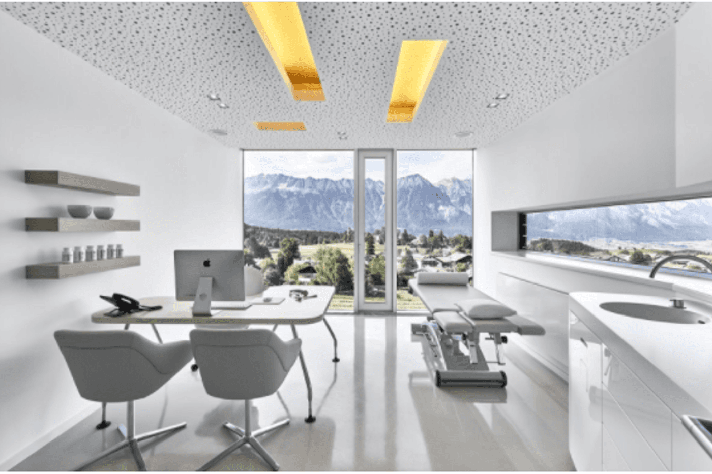
World-leading medical spa, Lanserhof, on the other hand, use very crisp, white tones that speak to the minimalist atmosphere. The light, bright colours create a sense of space like a breath of fresh air and truly reflect the Lanserhof brand image—a space all about health, cleanliness, detoxing and overall wellness.
3. Motel One: The signature accent
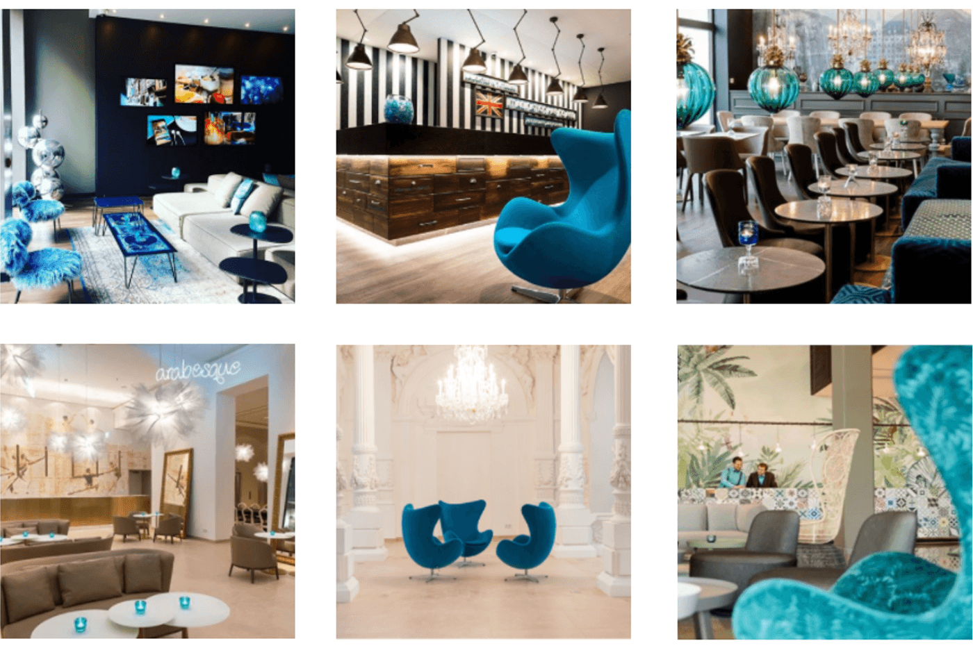
These images from affordable, design hotel brand, Motel One, are a great example of how a hotel can capitalise on a signature colour. The turquoise egg chairs are the hotel brand’s icon and can be seen throughout their imagery, with other turquoise accents featuring throughout the hotels too. The individual hotels are designed to reflect their various city-centre locations, so the turquoise is essential as a recognisable thread connecting all the images together.
Think about your subject:
What is the main focus of your image?
Does it include people? What are they doing? Who are they?
Do you want people to focus on the subject itself, or is the context and setting also important?
This links back to your brand’s target audience: If you have an offering specifically for preschool-aged children, make sure your images feature families with young children and things that matter to this audience, rather than photos of couples or families with older children.
If your luxury hotel offers organic produce grown on-site and the food you offer is a core message you want to communicate to your audiences, then showcase the garden itself, the delicious dishes that your chefs prepare, along with photos of other guests enjoying their meals!
Prospective guests need to be able to identify themselves with your brand and see themselves, or a passion of theirs, reflected in your photos.
Make use of natural lighting
Lighting is the holy grail of all photography.
Use natural light whenever possible and avoid dark, grainy scenes. Clarity is key.
Indoor photos can be completely transformed when taken during daylight hours with the drapes thrown open; Use sunlight to your advantage for striking images that shine.
Who should take the photos?
Now that you know what to look for and what to consider when curating images for your travel brand, the question remains: who should take your pictures?
While hiring a professional photographer has its benefits, it does come with a cost. You also risk running out of content when you have used all the images provided to you.
Another very viable option is to get your staff involved.
Your staff are on the ground every day and spot the little details that an external photographer might miss. Of course, they would need to be briefed and trained on what we’ve talked about in this post. Here at Lemongrass, we specialise in assisting clients to develop their key messages and themes and then help to train teams accordingly. Something we have found immensely helpful is creating a Whatsapp group, which can then be curated by internal social media resources and/or a PR and social agency.
Another great way to generate content for your social channels is by using guests’ images – referred to as User Generated Content. Encourage them to tag you in their pictures, or use a unique hashtag, and then share their photos (with their permission and always crediting them of course).
Not only will this create content that you might not be able to generate on your own, it creates and sense of connection between you and your guests, making their experience last far longer than the time they spent at your luxury hotel or resort.
Ultimately, what it all comes down to is making sure you’re always thinking about how the photos and images you use communicate your own brand story, and what you have to offer your guests. While all these guidelines and tips should get you well on your way — don’t be afraid to experiment and try something new!
And, if you’d like someone to help with your social media strategy, from developing the key messages you want to communicate through social media, the themes you should be focusing on, to developing consistency and recognition in your brand style, then don’t hesitate to contact us at grow@lemongrassmarketing.com, we’d love to talk with you.